This plugin started with one question:”How can I visualize patterns in my WordPress data without exporting to Excel or buying a big analytics suite?”I needed quick insights—which categories are most active over time, how content performs during the week, or when users are most engaged. Tables weren’t enough. I wanted something visual, dynamic, and built into WordPress.So I built Heat Map Graph—a plugin that turns SQL queries and external data into interactive visualizations you can embed anywhere.
Turn Your WordPress Data Into Beautiful, Interactive Visualizations
What It Does
Heat Map Graph lets you create interactive charts from your WordPress database or external APIs. Start with heat maps in the free version, or upgrade to unlock bar charts, pie charts, and line graphs.You can visualize:
- Content performance across categories and dates
- User activity patterns
- Sales or revenue trends
- Custom metrics from any WordPress table
- External data from REST APIs or CSV files (Premium)
Then embed any chart anywhere with a simple shortcode:
“`” data-section-index=”18″ style=”border-radius: 4px; line-height: 19.5px; margin: 6px 0px; position: relative; scroll-margin-bottom: 40px; scroll-margin-top: 40px; color: rgba(228, 228, 228, 0.92); font-family: -apple-system, “system-ui”, sans-serif; font-size: 13px; font-style: normal; font-variant-ligatures: normal; font-variant-caps: normal; font-weight: 400; letter-spacing: normal; orphans: 2; text-align: start; text-indent: 0px; text-transform: none; widows: 2; word-spacing: 0px; -webkit-text-stroke-width: 0px; white-space: normal; background-color: rgb(24, 24, 24); text-decoration-thickness: initial; text-decoration-style: initial; text-decoration-color: initial;”>
No external tools, no extra accounts—everything runs inside WordPress.
Why It’s Useful
Perfect for:
- Content creators tracking post performance and trends
- E-commerce stores analyzing sales data and patterns
- Membership sites monitoring user engagement
- Agencies creating client dashboards
- Developers building custom reporting tools
- Anyone who wants to visualize WordPress data
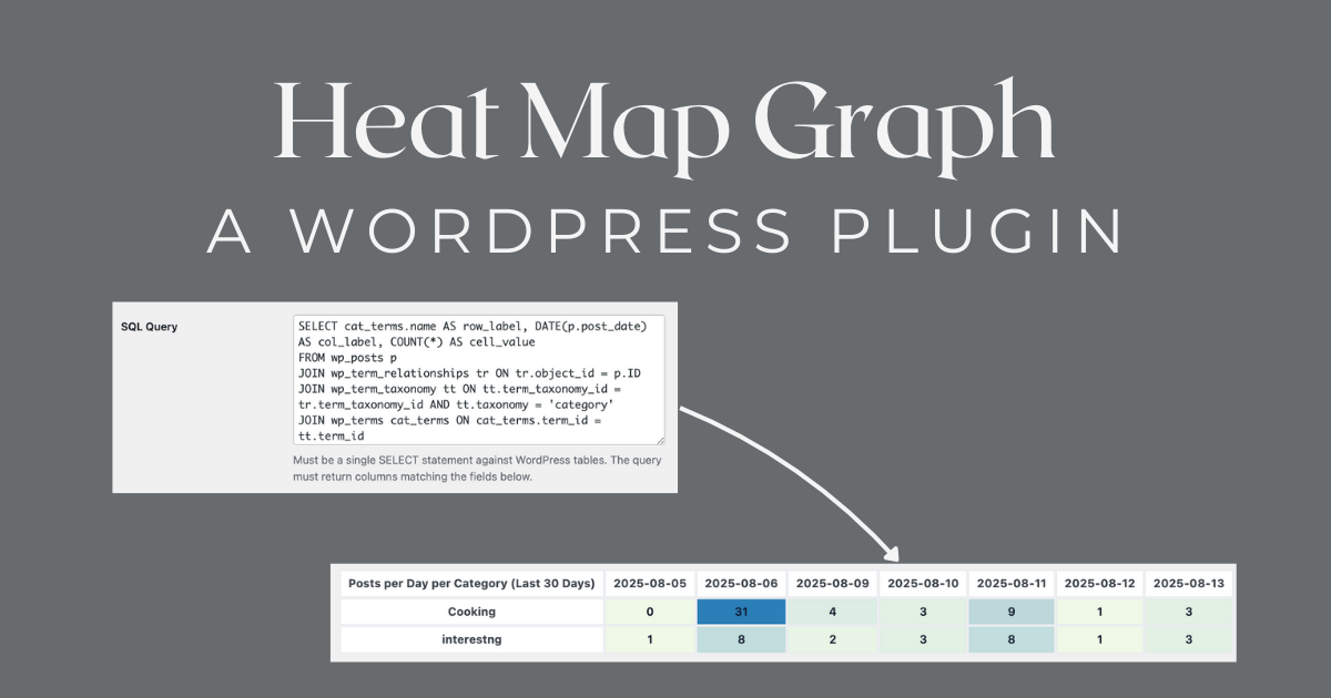
Because the plugin uses validated SQL (with strict security checks), you can visualize almost anything in your WordPress database—posts, comments, orders, memberships, custom post types, and more.
Key Features
Free Version — Powerful Heat Maps
📊 Custom SQL QueriesRun validated SELECT statements against your WordPress tables with built-in security.🎯 Field MappingChoose which columns represent rows, columns, and values.🌈 Custom Color RangesSet min/max colors (HEX) for visual clarity and style matching.📌 Shortcode SupportEmbed any map in posts, pages, or templates with an ID-based shortcode.🗂 Sample Charts IncludedGet started with examples like Posts per Day per Category or Post Status Distribution.
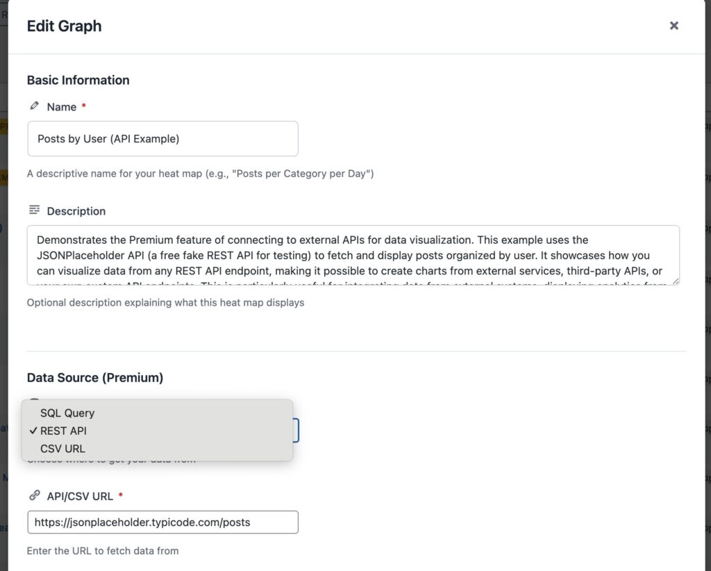
Premium Features — Advanced Visualization
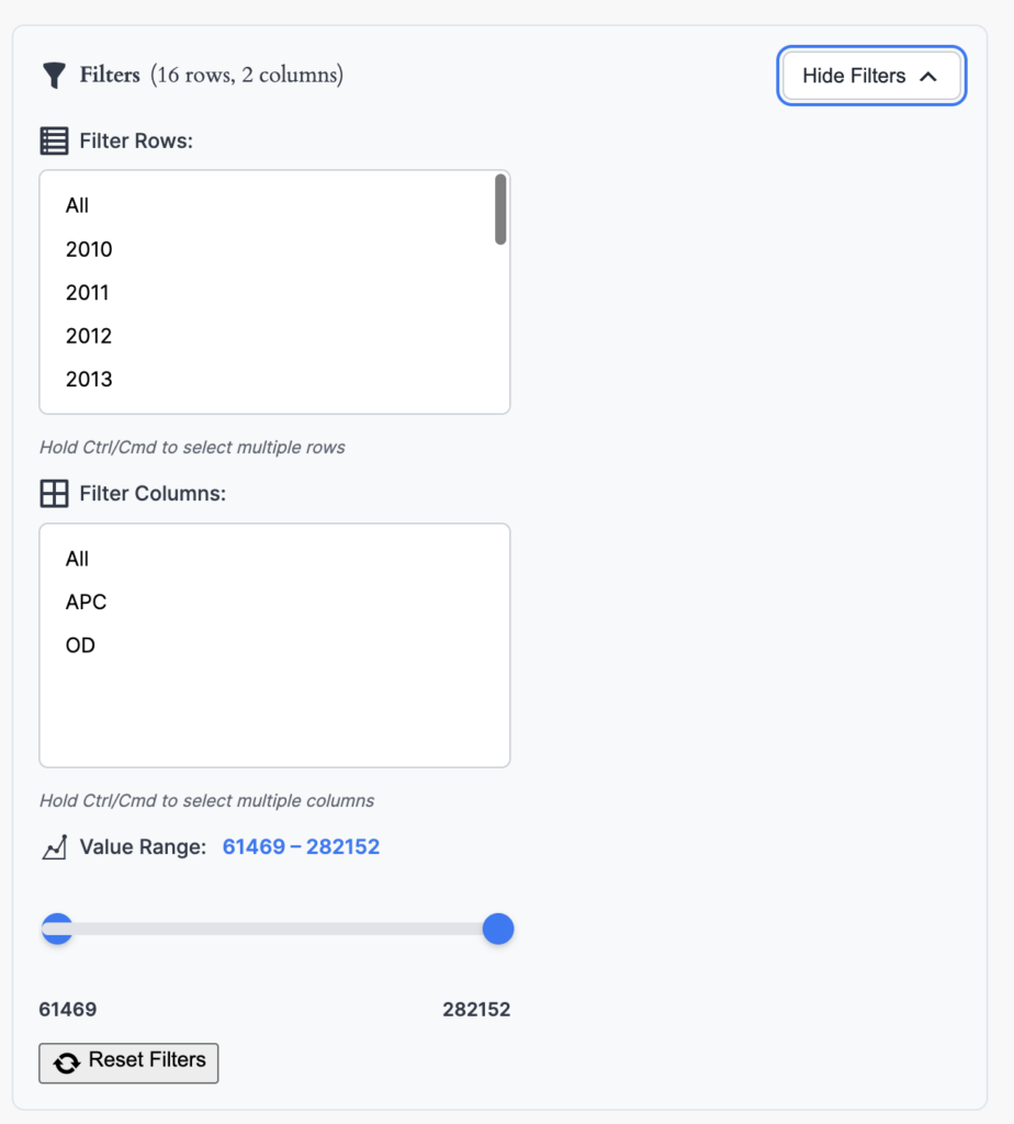
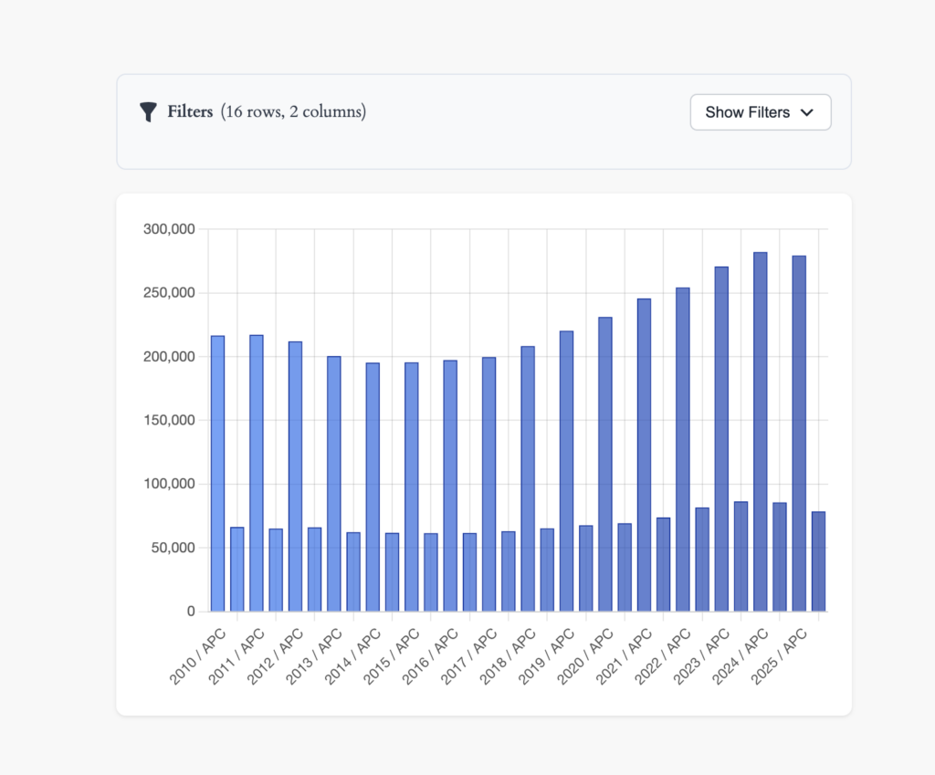
📈 Multiple Chart TypesGo beyond heat maps with bar charts, pie charts, and line graphs.🌐 External Data SourcesConnect to REST APIs and CSV URLs to visualize data from anywhere.🎛️ Interactive Filters (Slicers)Let users filter and explore data dynamically.📥 CSV ExportExport chart data with one click for further analysis.🔗 Chart LinkingCreate dashboards with multiple linked charts that filter each other.
Security First
- Blocks DML/DDL keywords (INSERT, UPDATE, DELETE, DROP, etc.)
- Prevents multiple statements
- Only admin users can create/edit charts
- Nonces and sanitization protect the UI
- SQL injection prevention with strict validation
What It’s Good For
- Spotting publishing trends over time
- Identifying underperforming content categories
- Tracking seasonal activity spikes
- Creating internal editorial dashboards
- Building client reporting without leaving WordPress
- Visualizing external data sources (Premium)
- Creating interactive data exploration tools (Premium)
Why Release It?
I realized other WordPress admins and developers face the same problem—wanting quick, visual answers from their own site data without exporting to external tools. This plugin removes that step, gives flexibility, and keeps everything secure.It’s intentionally lightweight—no tracking, no cloud storage, no bloated scripts—just your data, visualized instantly.
Plans for the Future
- Additional visualization styles (bubble charts, density plots)
- Click-to-drilldown on cells for detail views
- WP-CLI integration for automated chart generation
- More external data source connectors
- Enhanced dashboard customization options
Final Thoughts
If you’ve ever stared at a WordPress admin report wishing it was more visual—or if you need to share data trends with a team or client—Heat Map Graph might be what you need.It’s simple, secure, and flexible enough to handle everything from editorial metrics to user behavior analysis. Start with the free version and its heat maps, or upgrade to Premium for multiple chart types, external data sources, and interactive features.Install it, try the sample charts, and start turning your data into insights you can actually use.
— Hayan
Data Visualization, Analytics, WordPress Plugin, Heatmap, SQL, Content Strategy, Site Insights, Data-Driven Decisions, Reporting, Dashboard Tools, WP Shortcodes, WP Admin Tools
Now you can use this shortcode on any page or post, easy beasy
- Learn more about WordPress shortcodes and how they work.
- Contribute or use the plugin for free on github